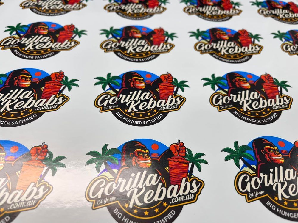
How To Choose A Font For Your Custom Stickers


The type of font you use for your
custom stickers will be a big factor in the overall design. By choosing the right font, you can have an immediate impact on how people perceive your
stickers.
There are many fonts to choose from, and they each have their own characteristics that make them more or less appropriate for different sticker projects.
This article will cover all aspects of choosing a good font for your project so you’ll know what to look for when shopping around.
We have also included tips on using fonts effectively in designs and some examples of how different fonts can be used on stickers.

How to use fonts in your designs
When choosing a font for your custom stickers, it’s important to consider how you will use it in your design. Some fonts are better suited for certain applications than others.
Here are a few tips on how to use fonts effectively in your designs:
-
Keep it simple – When using multiple fonts in a design, keep it simple by using one or two fonts at most. Too many fonts can make your design look cluttered and confusing.
- Use complementary fonts – If you want to use multiple fonts, choose complementary fonts that work well together. For example, a playful font like Comic Sans can be paired with a more professional font like Helvetica.
- Use the same font throughout your design – If you want your design to have a uniform look, use the same font throughout. This will create a cohesive look that is sure to impress your audience.
- Use fonts for emphasis – If you want to highlight a specific part of your design, use a different font to draw attention to it. This will help your design stand out from the rest.
- Be careful with novelty fonts – While novelty fonts can be fun and playful, they should only be used sparingly in designs. Overusing them can make your design look childish and unprofessional.
The most popular fonts and their characteristics
There are many different fonts to choose from, but some are more popular than others. Here are some of the most popular fonts and their characteristics to help you understand how and why they are used:
- Helvetica – This font is clean and simple, making it perfect for use in professional designs. It’s also very versatile, meaning it can be used for a variety of different projects.
- Comic Sans – This font is often used for children’s projects because of its fun and playful style. However, it isn't recommended for more professional designs.
- Times New Roman – This font is classic and timeless, making it perfect for formal designs. It’s also very readable, which is why it’s often used for documents and other text-heavy designs.
- Arial – This font is very similar to Helvetica, and it’s also a popular choice for professional designs. It has a clean and simple style that makes it easy to read, which is important for any text-heavy design.
- Georgia – This font is similar to Times New Roman, but it has a more modern style. It’s perfect for designs that need a touch of elegance, and it’s also very readable.